Successful logo recognition is an indispensable part of brand perception. Logos are more than just symbols; they are visual representations of the core messages that brands wish to convey to their customers.
The Secret Behind FedEx’s Logo Success
Mục lục
In a world brimming with brand imagery, crafting a distinctive and recognizable logo presents a significant challenge. Join us at Vnb Outsouce as we explore “What have major companies around the world achieved in enhancing their logo designs?” and “Why have they been successful?” This exploration will allow us to draw valuable lessons from their logo strategies.
The Evolution of FedEx’s Logo
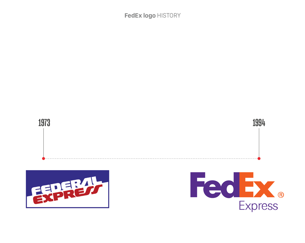
FedEx’s logo journey began in 1973, initially featuring the words “FEDERAL EXPRESS” in a unique style set against a blue/white background. However, a pivotal change occurred in 1994 when FedEx introduced a new logo, incorporating a subtle white arrow hidden between the letters E and X. This design has become a classic symbol of FedEx, still visible everywhere today.
The Refined Design of the FedEx Logo
FedEx’s approach to its logo goes beyond merely incorporating an arrow. The clever integration of a white arrow between the E and X not only symbolizes speed and motion but also signifies precision and reliability—critical attributes for a leading shipping and logistics brand.
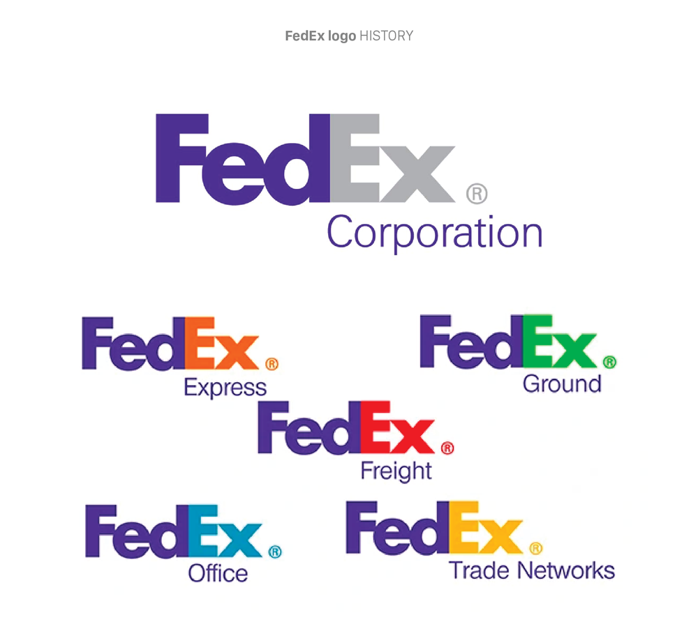
Moreover, FedEx cleverly uses colors to represent its various operational sectors. The purple of “Fed” and the diverse colors of “Ex” change depending on the service or product. For instance, for their express shipping service, FedEx Express, purple combined with orange creates a vibrant and dynamic appearance. Meanwhile, FedEx Trade Networks uses yellow for “Ex” to reflect professionalism and credibility in customs and transportation services.

By altering one of the colors in their logo, FedEx creates a symbol for each different area of operation. Because color psychology is vital in business, each color can reflect a specific aspect of your brand.
With the change in colors in the logo, FedEx has created an icon for each different operational area of the company. In this way, they demonstrate a deep understanding of color psychology and how to apply it in business.
Color psychology plays a significant role in building a brand image. Each color brings a different emotion and can reflect a specific aspect of the brand. Changing colors in the logo is not just about changing colors but about conveying a clear and effective message about your brand.
Importantly, FedEx has proven that changing colors in a logo can create a strong impression and positively impact brand building. Learn from their experience and apply it to your business. Also, don’t forget to study color psychology to choose the most appropriate colors for your brand and business goals.
Why not try designing a logo like FedEx? Bring a “fun” moment when customers realize the hidden element in the logo and enhance the intelligence in design to make the brand look more interesting.

